

Visit Site
Objective
I wanted to facilitate a new site creation that would implement friendlier colors and better user navigation. After discussion and research, it was determined that the client's previous site lacked organized and failed to use proper design techniques. After agreement, I elected to design a brand new site that would offer easier navigation, organization and aesthetic pleasure while showcasing their baked goods.
process
I began my design process idea-boarding using what I felt the site should portray. After making this decision, I then began wire-framing a final layout before moving into the site-building process. Upon completion of the design of their new logo, my next step was to hand pick the colors and content. Lastly, I organized the homepage to be more user friendly and easy to navigate by using user experience best practices.
SOLUTION
As you can see, the new design illustrates a more fluid user experience. The newly-designed logo provides a well-recognized brand that every company would prefer. Along with these new enhancements to the design, the new color scheme complements all the implementations that were put into place. We are left with an aesthetically pleasing design demonstrating the strength of a brand.

VISIT SITE
Objective
I aimed to develop a website that would provide an online presence with a consistent brand. After discussion and research, I came to the realization that I first needed to create a logo, and then create the website based on the logo I create. After agreement, I decided to design a fully-functional website to showcase the client's products and services while also maintaining a fluid user experience.
process
I started off my design process by sketching ideas of different elements to include on the site. After hashing out which ideas would work best, I mocked up a final layout for the website in Photoshop. I then developed a logo for the business. I implemented the green and blue colors from the logo onto the website to broadcast a sense of serenity. Finally, I made sure the client's products and services were identified on the homepage, front and center.
Results
As you can see, the website exemplifies a streamlined brand. The logo and website work together to portray a go-to source when it comes to health and wellness. Overall, the Ash Tree Wellness business has a solid identity that is now showcased not only physically but online as well.

Objective
I wanted to create a graphic that streamlined the different software products and features and showcase them in an easy-to-understand way. After collaborating with the stakeholders involved (CEO, Product Manager, etc.), I came to the conclusion that I needed to develop a clear and visually-appealing graphic that defined each product and its associated features.
process
I first gathered all of the information that I would include in the graphic and sorted it into a hierarchy from product to feature. I decided "chart" format would work best with a flow from left to right in order to logically sort the information for the reader. I mocked up a few different format ideas before running them by the stakeholders I mentioned above. After I took into consideration their comments and critique, I created a more finalized version of the graphic in Illustrator. Lastly, I made sure to align each aspect of the graphic to make it pixel-perfect and color-coded it according to software type.
Results
The final graphic embodies each aspect I strived to portray: clean lines, clear flow of logic, use of the company's colors to make it visually appealing and satisfies all parties involved. The graphic provides a concise diagram to visualize each product the company specializes in, along with all the moving pieces involved in each.
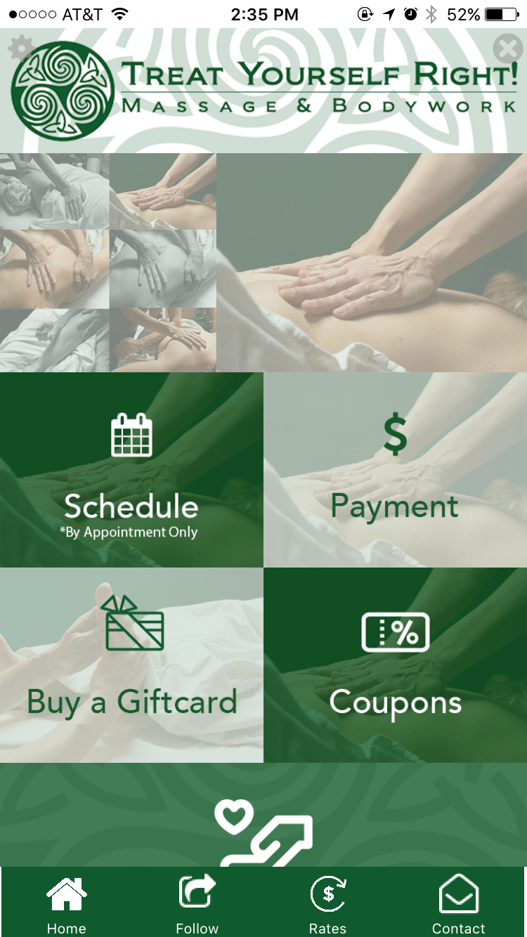
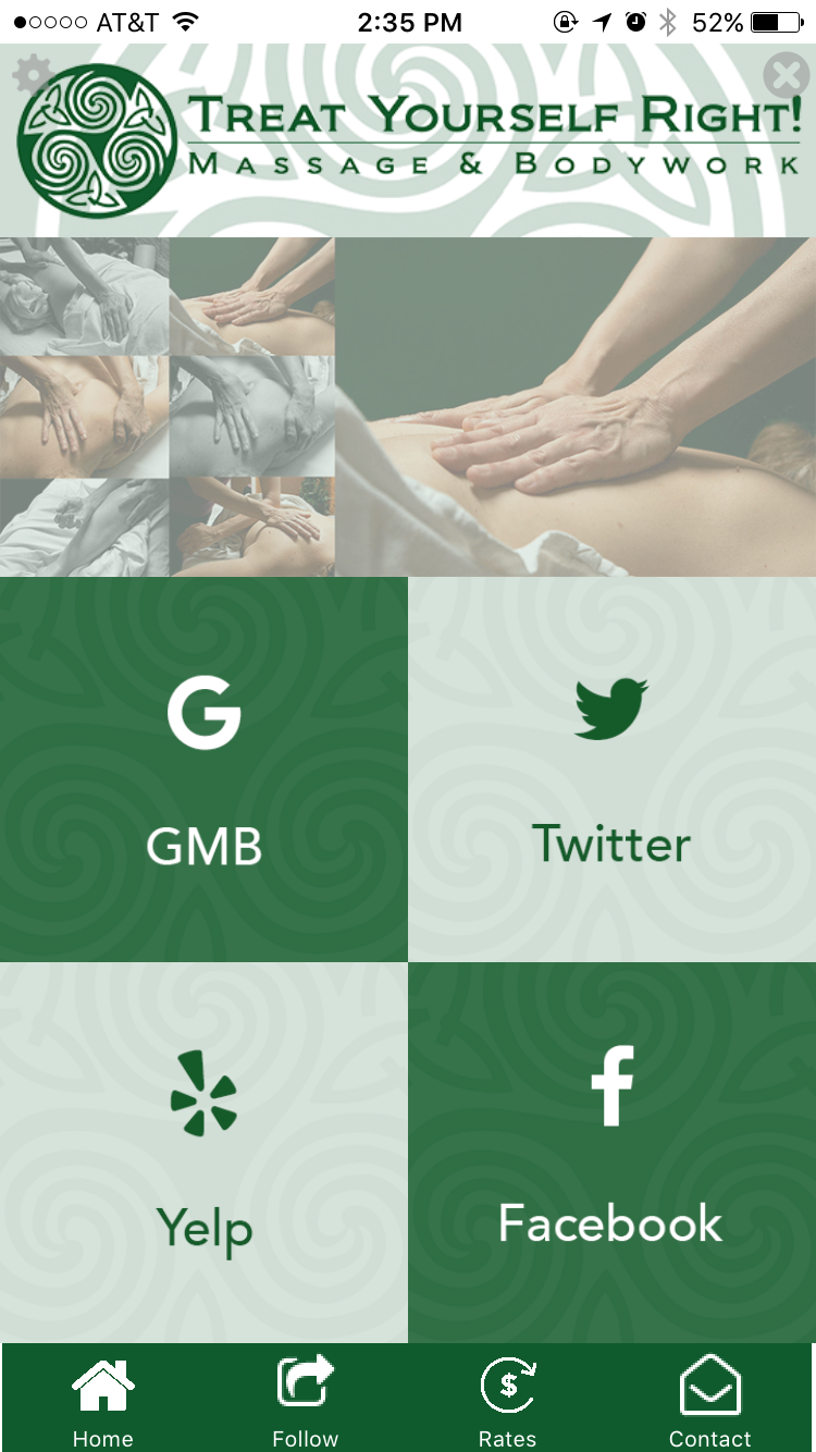
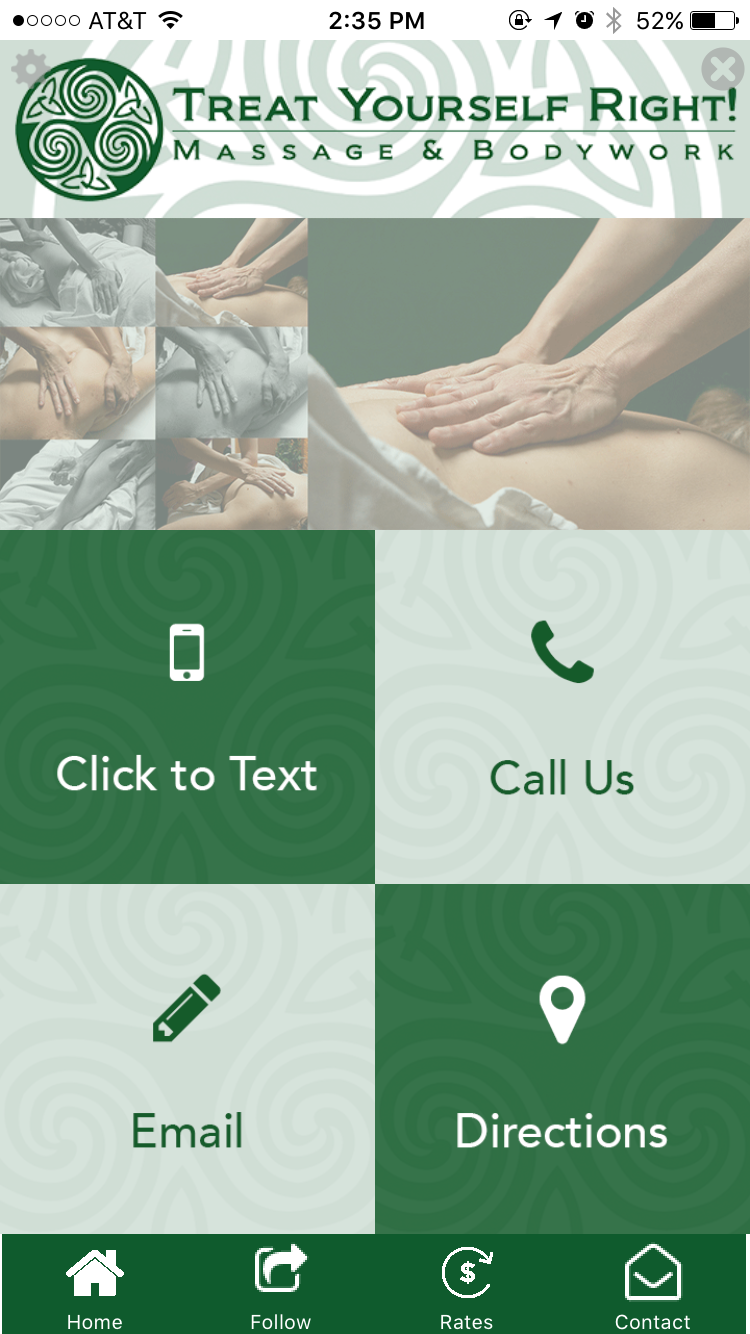
Objective
I desired to develop a mobile application for the client that provided the features they desired, while also creating a visually-appealing and user-friendly experience. After research and discussion, I decided that I needed to focus first and foremost making it easy-to-use, and secondly, making sure it appealed to the client's customer base - as in, it was very obviously a Massage and Bodywork salon.
process
I first sketched out each page of the application, making sure to include each feature they wanted included in the app. After, I wire-framed the app in Photoshop including the client's logo, coordinating color scheme, appropriate pictures and a logical flow from each page. Once I created the actual app, I double checked to make sure the user wouldn't have to think twice about what feature they were selecting and making sure they were very clear.
Results
The mobile application not only highlights the salon's selected features, but provides a fun, user-friendly experience to booking appointments and what they salon can do for you. It is clean, colorful without being overwhelming, full of imagery and overall a sleek application that provides a very consistent brand for the salon.